All posts

Anchoring bias is our habit of leaning too hard on the first number we see. Every estimate after that gets dragged towards it, even when we know the number is random. In a shop, that first number is usually a price, and it decides whether the next price feels cheap or expensive.
This page has 10 real anchoring bias examples: five from research and five from real brands and shops. Then it covers where anchoring turns into a pricing offence, and how to use it honestly on your own store. It's part of our wider guide to ecommerce psychology.
What anchoring bias is
The term comes from Amos Tversky and Daniel Kahneman's 1974 paper in Science, "Judgment under Uncertainty: Heuristics and Biases". Their point was simple. When we don't know a value, we grab a starting point and adjust from it. The trouble is we don't adjust enough, so the starting point quietly sets the answer.
Boost Your Conversion Instantly with Nudgify: Turn your website visitors into customers with real-time Social Proof and FOMO Nudges. Get Started Now →
Two things matter for store owners:
- The anchor doesn't have to be relevant. In several of the studies below it was a random number, and it still worked.
- Knowing about it doesn't switch it off. Experts fall for it too.
Anchoring bias examples from research
1. Tversky and Kahneman's wheel of fortune
The original. People watched a wheel of fortune that was rigged to stop at either 10 or 65. They were asked whether the percentage of African countries in the United Nations was higher or lower than that number, then asked for their own estimate.
The group that saw 10 gave a median estimate of 25%. The group that saw 65 gave a median of 45%. A 20-point gap, caused by a wheel everyone knew was random.
What it means for a store: the first number on the page is doing work, whether you chose it or not. If the first price a visitor sees is your cheapest product, everything else looks expensive next to it.
Increase Trust & Sales with Social Proof
Boost trust, engagement, and conversions with Social Proof — tailored for any industry and easy to integrate. Seamlessly manage client access with our team portal.


2. MIT students and their social security numbers
In a 2003 study published in the Quarterly Journal of Economics ("Coherent Arbitrariness"), Dan Ariely, George Loewenstein and Drazen Prelec showed 55 MBA students six products: computer accessories, wine, chocolates and a book. Each student was first asked if they'd buy each item for a dollar amount equal to the last two digits of their social security number. Then they said the most they'd pay. The bids were real, and some products were actually sold.
Students with above-median numbers bid 57% to 107% more than those with below-median numbers. The top fifth bid about three times as much as the bottom fifth. For a cordless keyboard, the top group offered $56 on average. The bottom group offered $16.
What it means for a store: people don't walk in with a fixed idea of what your product is worth, especially if it's new to them. The number you show first helps build that idea.
3. Estate agents and a house in Tucson
Gregory Northcraft and Margaret Neale took real estate agents and business students on a tour of a real house for sale. Everyone got the same 10-page information pack, except for one detail: the listing price, which was set higher or lower depending on the group.
Both the agents and the students gave estimates of the house's value that moved with the listing price they'd been given. The agents had years of experience pricing houses. It didn't protect them. (Northcraft and Neale, Organizational Behavior and Human Decision Processes, 1987.)
What it means for a store: shoppers don't need to be naive for this to work. A believable starting price sways people who know the market well.
4. "Limit 12 per person" on a soup display
In a 1998 study by Brian Wansink, Robert Kent and Stephen Hoch, grocery stores sold soup at 79 cents with one of two signs. One said "No Limit per Person". The other said "Limit Twelve per Person".
According to the University of Illinois press release about the study, shoppers typically bought three or four cans with the first sign and seven with the second. The number 12 became the anchor for how many to buy.
A note on the source: Wansink's later work led to a large number of retractions from 2018 onwards. We found no retraction for this paper, but treat the exact figures with some care.
What it means for a store: a quantity number can anchor quantity, not just price. "Limit 3 per order" on a genuinely limited drop tells people to think in threes. It's a close cousin of scarcity marketing, and it only works honestly when the limit is real.
5. "3 for $3" instead of "$1 each"
The same study looked at multi-unit pricing. Across 21 products in 89 grocery stores in Chicago, Philadelphia and Iowa, the researchers changed price tags from "One for $1.00" to "Three for $3.00". Same price per item. The press release says this raised average sales by over 30% in twelve of thirteen product categories.
What it means for a store: the number on the tag doesn't only say what something costs. It hints at how many to buy. A "2 for $40" offer on a $20 product suggests two, without discounting anything.
Anchoring examples from real brands
6. Apple's $999 iPad tease
When Steve Jobs launched the iPad in January 2010, he didn't open with the price. He opened with what everyone expected the price to be. "If you listen to the pundits, we're going to price it under $1,000, which is code for $999," he said. Then he announced the actual starting price: $499.
Analysts quoted before the launch had guessed around $1,000. Apple used that guess as the anchor and then came in at half of it. Apple never called this anchoring, but it's hard to read it any other way.
What it means for a store: if you're launching something at a price lower than people expect, say what they'd expect to pay first. "Comparable sets sell for $200 to $300. Ours is $129." Only do this if the comparison is real and checkable.
7. The $10,000 Apple Watch
When the Apple Watch went on sale in 2015, the Sport model started at $349. The 18-karat gold Apple Watch Edition started at $10,000.
Most buyers were never going to spend $10,000 on a watch. That wasn't necessarily the point. With a $10,000 version in the same line-up, a $349 watch looked restrained. Whether Apple meant it that way or not, a premium version makes the standard version feel sensible.
What it means for a store: having one premium product in a range can lift sales of the mid-priced ones, even if the premium one rarely sells. Put it first on the collection page.
8. J.C. Penney removes the anchors
In 2012 the US department store J.C. Penney, under new CEO Ron Johnson, dropped its hundreds of yearly sales events and coupons. Instead it cut prices permanently, by about 40%, and called it "Fair and Square" pricing. No inflated "original" prices, no fake markdowns.
Customers didn't like it. Total sales for 2012 fell 24.8% to $12.985 billion, the company's lowest yearly revenue since 1987, and it lost $985 million. Johnson later called the pricing change a mistake and said he took personal responsibility for it. The company brought back sales and coupons.
What it means for a store: shoppers judge a deal by comparison. Take the comparison away and a low price stops feeling like a deal. The fix isn't fake "was" prices. It's real reference points, like your genuine former price or the cost of the alternative.
9. Preset tip screens
If you've paid for a coffee on a tablet recently, you've seen this one. Square's developer documentation says its tip settings default to 15%, 20% and 25%. Those three buttons are anchors. They make 15% to 25% look like the normal range, and the middle one feels like the safe pick.
What it means for a store: preset amounts work anywhere a customer chooses a number. Donation add-ons at checkout, gift card values, subscription quantities. Whatever you offer as presets will shape what people pick.
10. Shopify's compare-at price
The most common anchor on any store is the crossed-out price. Shopify builds it in. Shopify's help centre explains it with an example: set a product's price to $10 and its compare-at price to $30, and "your theme displays both prices alongside a badge with a sale message."
The $30 is the anchor. It tells the shopper what the product is worth, so $10 reads as a bargain.
What it means for a store: it's the strongest anchor you have, the easiest to abuse, and the one regulators watch.
When anchoring crosses the line
A real former price is a legitimate anchor. A made-up one is deceptive pricing, and it's written into law in most places you're likely to sell.
- United States. The FTC's Guides Against Deceptive Pricing (16 CFR 233.1) say a former price is a fair comparison only if it's "the actual, bona fide price at which the article was offered to the public on a regular basis for a reasonably substantial period of time." A price inflated just so you can cut it is described as "fictitious".
- European Union. Article 6a of the price indication rules, added by the Omnibus Directive (EU) 2019/2161, says any announced price reduction must show the prior price, and the prior price means "the lowest price applied by the trader during a period of time not shorter than 30 days prior to the application of the price reduction." So raising a price for a week and then "cutting" it doesn't work.
For a Shopify store, that means: only fill in compare-at price with a price you actually charged, recently, for a decent stretch of time. If you sell into the EU, use the lowest price from the last 30 days, not the highest.
How to use anchoring honestly on your store
None of this needs tricks. It needs you to decide which number a shopper sees first.
- Lead with your premium product. Sort collection pages so the top of the range appears first, not the cheapest item (examples 6 and 7).
- Show real reference prices. Use compare-at prices only when they're genuine and recent (example 10). Where you've never sold at a higher price, compare to something real instead: the per-unit cost of buying singly, or what it costs to do the job another way.
- Use multi-buy pricing to suggest quantity. "2 for $40" sets the expectation at two (example 5).
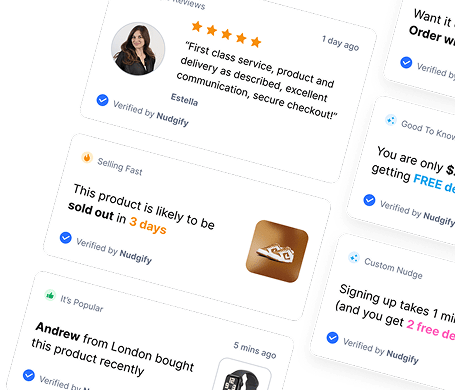
- Make free shipping thresholds visible. A free shipping threshold is an anchor for basket size. "Free delivery over $60" gives shoppers a number to aim for. A free delivery nudge shows the threshold and how far the shopper is from it before they reach checkout.
- Set presets with care. Wherever customers pick an amount, the presets you offer are the anchor (example 9).
- List plans from the top down. If you sell tiers or memberships, the first plan people read sets the scale for the rest. If you have three or more tiers, read our guide to the decoy effect too, because tier pages are where anchoring and decoys overlap.
Anchors set what a product feels worth. They don't say whether it's good. Social proof and anchoring work well together: the price says "this is good value", the proof says "and other people agree".
Nudgify shows that proof on your store from real order and visitor data. There's a free plan, and paid plans start at $9 a month with a 7-day trial. See Nudgify pricing.
Anchoring bias FAQ
What is anchoring bias in simple terms?
Anchoring bias is the habit of relying too much on the first number you see when you judge a value. Later estimates get pulled towards that first number, even when it's obviously random. Kahneman and Tversky described it in 1974.
What is an example of anchoring in marketing?
The most common one is a crossed-out "was" price next to a lower sale price. The higher number sets what the product feels worth, so the real price feels like a deal. Other examples are showing a premium product first, multi-buy offers like "3 for $3", purchase limits, and preset tip or donation amounts.
Is price anchoring legal?
Yes, as long as the anchor is real. In the US, the FTC's pricing guides say a former price must be one you genuinely charged for a reasonably substantial period. In the EU, the Omnibus Directive says a "was" price must be the lowest price you charged in the 30 days before the discount. Inventing a high price just to cut it is deceptive in both.
What's the difference between anchoring and the decoy effect?
Anchoring is about one number setting the scale for everything after it. The decoy effect is about adding a slightly worse option so a similar, better option looks like the obvious pick. Decoys often work partly through anchoring, but they need at least three options to compare.

Increase your sales and sign-ups by up
to 15% from $9/mo. only with our Social Proof & FOMO App
Add to Shopify